


Have you ever felt this way?
You've scrolled through countless home decor blogs, saved over a hundred photos of your "dream home,"
yet when it comes time to choose curtains for your own space, you still don't know where to start.
The truth is, curtain styling isn't as complicated as it seems. Over 25 years at Foulola,
we've distilled our experience into three simple, easy-to-remember formulas. Master these, and you'll be styling like a pro in no time.
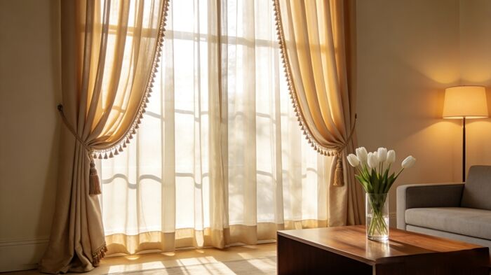
Formula 1: Light Walls, Medium Curtains; Dark Walls, Light Curtains
This is the most fundamental rule, and the one that's hardest to get wrong.
What It Means:
1)If your walls are light (white, light grey, beige): Choose curtains that are one shade darker. This adds depth and layers to the space.
2)If your walls are dark (grey-blue, forest green, coffee tones): Choose curtains that are lighter than the wall color. This prevents the room from feeling too heavy or enclosed.
Why It Works:
Walls are the largest color block in any room; curtains are the second largest. These two elements need to relate to each other—distinct, but harmonious. "Light walls, medium curtains; dark walls, light curtains" creates a natural gradation, ensuring they complement rather than compete with each other.
For Example
1)Scenario A: White walls + Light grey curtains → Clean, fresh, suits most styles.
2)Scenario B: Light grey walls + Mid-grey curtains → Rich with layers, instantly elevates the space.
3)Scenario C: Forest green walls + Off-white curtains → The lighter curtain provides "breathing room" for the deep wall color.
Pro Tip: Follow the "Fifth Wall"
If your walls are a neutral white, you can also let your curtains follow the ceiling. When the ceiling is white, choose a curtain shade darker than the wall. If your ceiling has a color tint, let your curtains coordinate with that.
Formula 2: Let Curtains Follow the Floor
If you're completely stuck on color, here's an even simpler starting point—look at your flooring.
What It Means:
Let the dominant tone of your curtains echo your flooring, but feel free to vary the shade intensity.
1)Dark wood floors → Choose curtains in the same color family, but a few shades lighter (e.g., oak floors with light coffee curtains).
2)Light wood floors → Choose warm-toned curtains slightly deeper than the floor color (e.g., light oak floors with milk tea curtains).
3)Grey tiles → Choose grey curtains in a similar tone, playing with different shades of grey.
Why It Works:
The floor is the largest horizontal color block, while curtains are the largest vertical one. When these two elements echo each other, the room gains a natural sense of cohesion and flow.
The floor color often sets the room's foundation; following its lead is a safe and stylish bet.
For Example
1)Natural wood floors + Milk tea curtains → The signature look for Japanese and Scandinavian styles, warm and soothing.
2)Dark walnut floors + Caramel curtains → Rich with vintage appeal, perfect for American classic or mid-century modern styles.
3)Grey tiles + Light grey / grey-blue curtains → A classic combination for modern and minimalist spaces.
One Exception
If your flooring is very dark (e.g., charcoal, deep brown), choose curtains that are at least two shades lighter. This prevents the room from feeling "top-heavy."
Formula 3: Stripes Lift Height, Solids Expand Space
This formula is all about choosing curtain patterns and how they affect the perception of your room's proportions.
Stripes Lift Height
1)The Principle: Vertical lines have an optical lengthening effect, making ceilings appear higher.
2)How to Choose: Opt for fine, dense vertical stripes—they look more refined than wide ones. Keep the color contrast subtle; shades within the same color family are the safest and most elegant choice.
3)Ideal For: Rooms with ceilings lower than 2.7 meters, small spaces where you want to create a feeling of height.
4)Example: Light grey curtains with fine, dark grey vertical stripes can instantly make a room feel "taller" once hung.
Solids Expand Space
1)The Principle: Solid colors have no patterns to distract the eye. They create a visual "calm," making a space feel more open and spacious.
2)How to Choose: Pick colors with low saturation (think muted, elegant tones like the sophisticated shades of the Morandi color palette). Lighter shades within a color family tend to feel more expansive than darker ones.
3)Ideal For: Small apartments, cramped rooms, any space aiming for a minimalist aesthetic.
4)Example: Solid milk tea curtains, paired with a sofa and rug in similar tones, can make a compact living room feel surprisingly spacious and airy.
Pro Tip: How to Play with Color Blocking
If you're drawn to color-blocked curtains, remember this golden rule: Keep it simple, don't overdo it.
1)Vertical splits (top/bottom): Place the darker color at the bottom and the lighter on top. This grounds the look and feels visually stable.
2)Horizontal splits (left/right): Use a dominant main color (about 80% of the width) and a smaller, contrasting accent color (about 20%).
3)Heads-up: Avoid mixing three or more colors in a single panel—it's a recipe for a styling disaster.
Bonus: 3 "No-Brainer" Color Palettes
If you're still feeling overwhelmed, just copy one of these three tried-and-true combinations:
|
Style Direction |
Wall Color |
Curtain Color |
Perfect For |
|
Warm & Cozy |
Off-white / Cream |
Milk tea / Light coffee |
Bedrooms, Living Rooms, Kids' Rooms |
|
Cool & Modern |
Light Grey |
Mid-grey / Grey-blue |
Living Rooms, Home Offices, Modern Spaces |
|
Natural & Organic |
White |
Linen / Sage green |
Japandi, Scandinavian, Rustic style, Guesthouses |
A Final Thought
Curtain styling—it can be tricky, but it doesn't have to be. Master these three formulas, and you'll already be ahead of the game.
Here's a little secret from our team:
Whenever we help clients choose curtains, we do one crucial thing—we don't just look at color swatches.
We provide fabric samples to our clients, so they can take them to their window and let them "sit" next to the walls, the floor, and the furniture, right there in the real light.
Because even the best formula can't compete with seeing it for yourself, in the light where it will live.
If you're unsure about the right curtains for your home, just snap a photo of your window and send it our way. With 25 years of experience, we might just have the perfect answer you've been looking for.

