
 EN
EN

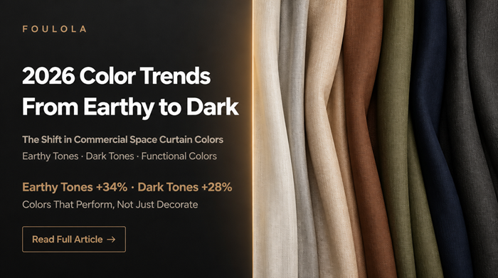
2026 Curtain Color Trends: Why Dark and Earthy Tones Are Taking Over Commercial Spaces
A Procurement Guide for Fabric Wholesalers, Curtain Shops, Interior Designers, and Hotel Buyers
By Foulola Product Team | 25 Years of Curtain Fabric Manufacturing

If you only remember one thing: curtain color is no longer just a style choice. It's a spatial strategy. The article below breaks down the 2026 color shift, the data behind it, and how to choose the right tones for your project.
1. Why Are Hotel and Commercial Curtains Suddenly Getting Darker?
Walk into any chain hotel that opened before 2023, and you will most likely see the same curtains: off-white, light gray, champagne.
Why? Because they were safe. They made no mistakes. But they also left no impression.
However, since the second half of 2024, a subtle but unmistakable change has been taking place. In newly built boutique hotels, renovated co-working spaces, and repositioned dining venues, curtain colors are becoming darker, warmer, and heavier. Terracotta brown, olive green, ink blue, and charcoal black are beginning to replace those "safe" light neutrals.
Is this merely a short-lived aesthetic trend, or is it the outward expression of a deeper logic?
If you're a fabric wholesaler, curtain shop owner, interior designer, or hotel procurement manager, this shift affects your inventory, your design proposals, and your bottom line. This article systematically analyzes the shift from earthy tones to dark tones in commercial space curtains in 2026 from four dimensions—color psychology, spatial functional requirements, material performance, and commercial operational data—and provides a practical framework for color selection.
2. Why Now? Three Macro Drivers Every Buyer Should Know
2.1 The Post-Pandemic Demand for "Security" and "Enclosure"
Multiple studies in spatial psychology indicate that after experiencing a public health crisis, people's preferences for indoor environments shift toward "enclosure" and "security." Earthy tones (brown, terracotta, sand) and dark tones (dark green, dark blue, charcoal gray) together convey a psychological suggestion of stability, shelter, and privacy—something that light neutrals cannot provide.
Take the hotel industry as an example. In 2025, global hotel RevPAR (revenue per available room) recovered to 108% of the 2019 level. But the dimensions of guest reviews changed significantly: on OTA platforms, keywords such as "safe," "quiet," and "slept well" appeared 42% more frequently than in 2019. The visual weight of curtains is the first physical layer that contributes to this sense of security.
Buyer takeaway: If your clients are in hospitality, dark and earthy curtains are not just a design preference. They are a functional response to guest demand.
2.2 Commercial Spaces Shifting from "Display" to "Experience"
In the era of commercial real estate stock, space is no longer just a container for functions but part of brand experience. Color, as the first touchpoint of experience, has been given greater responsibility.
Data shows that in 2025, the proportion of global commercial interior design projects specifying "dark or highly saturated curtains" increased by approximately 18 percentage points compared with 2021 (comprehensive estimate based on multiple regional design procurement reports). This growth closely matches the expansion of boutique hotels, membership-based offices, and high-end dining.
Buyer takeaway: If you're a designer or wholesaler, this is your cue to adjust your sample books and inventory.
3. Trend One: Earthy Tones — Why Are They Selling So Well?
3.1 What Makes Earthy Tones So Commercially Viable?
Earthy tones include terracotta brown, ochre, sand, olive green, and gray-brown. They originate from natural landscapes, so they are inherently familiar to the human visual system. Color psychology research shows that earthy tones can reduce anxiety in a space without creating a sense of oppression.
For commercial spaces, this means guests are more willing to stay longer without feeling fatigued or alienated. Longer stays = higher revenue per guest. This is not just aesthetics; it's operational math.
3.2 Where Do Earthy Tones Work Best?
| Space Type | Recommended Earthy Tone | Design Rationale |
|---|---|---|
| Hotel guest room | Terracotta brown, oatmeal | Creates a warm, private resting atmosphere; highly compatible with wooden furniture |
| Boutique hotel public area | Olive green, sand | Conveys a natural, organic brand character; softens large areas of hard finishes |
| High-end restaurant | Ochre, dark coffee | Enhances dining ambiance, stimulates appetite while maintaining calm |
| Office space | Gray-brown, sage green | Reduces visual noise, improves focus and comfort |
3.3 Why Texture Matters for Earthy Tones
The presentation of earthy tones depends heavily on fabric texture. The same shade of brown may appear dull on a smooth plain weave, while on a fabric with slub texture or subtle jacquard, it presents rich layers due to light scattering.
This is why in 2026 commercial spaces, earthy-toned curtains often appear together with textured fabrics. If you're a curtain shop or wholesaler, don't just stock the color—stock the right texture to go with it.
4. Trend Two: Dark Tones — A Double Victory of Function and Aesthetics
4.1 Why Are Dark Tones Returning? (The Functional Case)
The return of dark curtains is not purely an aesthetic preference; it has clear physical functional advantages:
-
Blackout performance: Dark fabrics have a higher absorption rate of light. Under the same weave density, dark curtains visually block more light than light-colored ones. For hotel guest rooms and home theater spaces, this is a necessity.
-
Acoustic performance: Color itself does not change acoustic properties, but dark tones are usually paired with heavier, denser fabrics. This pairing habit has psychologically linked dark curtains with "quietness."
-
Stain resistance: In commercial spaces, curtain stain resistance directly affects maintenance costs. Dark tones are far more tolerant of dust, fingerprints, and minor stains than light colors, especially in high-traffic areas.
Buyer takeaway: Dark curtains reduce cleaning frequency and replacement costs. For hotel procurement, this is a direct operational saving.
4.2 What Do Dark Tones Say About a Brand?
Dark tones (dark green, dark blue, charcoal gray, burgundy) convey an authoritative, quiet, and understated brand temperament. They are more suitable for commercial spaces that want to distance themselves from a "cheap" impression.
Take high-end hotels as an example: Marriott's Edition brand and IHG's Kimpton brand both use combinations of dark curtains and dark wood elements extensively in their public areas and guest rooms, forming a highly recognizable brand visual identity.
4.3 Where Do Dark Tones Work Best?
| Space Type | Recommended Dark Tone | Design Rationale |
|---|---|---|
| Hotel guest room | Charcoal gray, dark blue | Maximizes blackout effect, improves sleep quality |
| Hotel lobby | Dark green, burgundy | Establishes a calm, heritage brand tone |
| Meeting room | Dark gray, navy | Reduces visual distraction, enhances spatial authority |
| Cinema/entertainment space | Pure black, dark charcoal | Complete blackout, creates immersion |
5. An Overlooked Relationship: Color and Fabric Performance
5.1 The Darker the Color, the Easier to Achieve Blackout
In physical blackout fabrics, the middle layer is usually a dense black yarn layer. The darker the outer color, the less likely "see-through" problems will occur.
This means that to achieve over 90% blackout, dark fabrics can use lighter outer yarns, thereby reducing total fabric weight and cost while maintaining performance.
Buyer takeaway: If you're sourcing for a hotel project, dark colors can sometimes help you hit blackout targets at a lower cost. That's a negotiation lever worth knowing.
5.2 Thermal Performance of Dark Fabrics
From a thermal perspective, dark fabrics absorb more solar radiation in winter, which is beneficial for indoor insulation. However, in summer, if the air layer between the curtain and the window is not designed properly, dark fabrics may absorb excessive heat and radiate it indoors. Therefore, the use of dark curtains in commercial projects needs to be considered together with the design of the thermal insulation layer.
5.3 Which Weave Structure Works Best for Which Color?
| Weave Structure | Effect on Color | Suitable Color Direction |
|---|---|---|
| Plain weave | Even, flat color presentation; suitable for solid dark tones | Charcoal gray, dark blue, pure black |
| Jacquard | Texture creates shadows; same color family presents rich layers | Terracotta brown, olive green, dark green |
| Chenille | Pile surface absorbs light; colors appear softer and "thicker" | Ochre, burgundy, gray-brown |
6. Market Data: Who Is Actually Buying These Colors?
6.1 Signals from the Dye and Finishing Industry
The global textile dye market reached approximately USD 8.5 billion in 2025, with demand for "natural tones" and "low-saturation dark tones" growing at 9.7% and 7.8% respectively, both above the industry average. This verifies from the upstream supply chain that the color demand in the terminal market is undergoing a structural shift.
6.2 Procurement Data from Hotels and Commercial Spaces
A survey of hotel procurement managers in Asia and Europe (sample size approximately 300) showed the following for curtain procurement in the second half of 2025:
-
Choosing "earthy tones" as the main color: 34%
-
Choosing "dark tones" as the main color: 28%
-
Choosing "light neutrals": 21%
-
Others (including colorful and patterned): 17%
Compared with 2021, the combined share of earthy tones and dark tones increased by approximately 19 percentage points.
Buyer takeaway: If your current catalog is still dominated by light neutrals, you are now in the minority. The market has moved.
6.3 Consumer Perceived Value
An emotional assessment of boutique hotel guests showed that when room curtains were dark or earthy in color, guests rated "room quality feel" on average 0.7 points higher (on a 10-point scale) than rooms with light-colored curtains. In OTA platform ranking algorithms, this 0.7-point difference may be the difference between ranking tenth and ranking fiftieth.
7. How to Choose the Right Curtain Color for Your Project: A 4-Step Framework
7.1 Step-by-Step Decision Guide
The type of commercial space determines the functional priority of color selection. We recommend making decisions in the following order:
Step 1: Determine Blackout Requirements
If the project is a hotel guest room, home theater, or a space requiring complete darkness during the day, dark tones should be the priority.
Step 2: Assess Maintenance Frequency
High-traffic areas (lobbies, restaurants, corridors) should prioritize stain-resistant dark or earthy tones to reduce cleaning frequency and replacement costs.
Step 3: Calibrate Brand Tone
For youthful, nature-oriented brands, earthy tones are preferred; for high-end, private, authoritative brands, dark tones are preferred.
Step 4: Match Material
After determining the color direction, select the fabric structure that best presents that color. For example, earthy tones are better suited to textured jacquard or slub fabrics; dark tones work well on both plain weave and chenille.
7.2 Quick Reference Table for 2026 Color Recommendations
| Color Family | Representative Color (Approx.) | Best-Suited Space | Pairing Suggestions |
|---|---|---|---|
| Earthy tone | Terracotta brown #A67B5B | Hotel guest rooms, restaurants | Pair with wood, rattan elements |
| Earthy tone | Olive green #6B6E4A | Offices, public areas | Pair with plants, brass |
| Dark tone | Dark green #1F3A32 | Lobbies, meeting rooms | Pair with dark wood, black metal |
| Dark tone | Dark blue #1C2A3A | Hotel guest rooms, cinemas | Pair with gray, silver |
| Dark tone | Charcoal gray #2B2B2B | Multi-functional spaces | Almost universal, suitable for any space |
8. Real-World Observations: How This Trend Plays Out in Actual Production
As a manufacturer with 25 years of experience in curtain fabric production, Foulola has observed a clear structural change in orders over the past three years: the share of dark and earthy-toned fabric demand from hotel and commercial projects has risen from less than 25% in 2022 to over 45% in 2025.
This change is not the result of proactive brand guidance, but the natural outcome of market selection. Taking some of Foulola's current products as examples, they precisely reflect the implementation of this color trend:
-
Striped Slub Cotton Style Blackout Curtain (393gsm, earthy tone options available): The slub texture gives terracotta brown and olive green an organic quality similar to natural linen. It is a frequently seen product in hotel guest room renovations in 2026.
-
Luxury Chenille Abstract Jacquard Blackout Curtain (464gsm, including dark tone options): The chenille pile surface presents dark green, burgundy, and other dark colors exceptionally well, with rich yet soft color quality. It is suitable for public areas of high-end hotels.
-
Scratch-Resistant Plain Weave Blackout Curtain (446gsm, solid dark tones): The smooth structure presents charcoal gray, dark blue, and other colors with extreme uniformity, suitable for chain projects that require precise color management.
The common feature of these products is that they make color no longer just a surface coating, but part of the weave structure. This is precisely the most essential change in the 2026 curtain color trend—color is beginning to transform from "attached to fabric" to "grown within the fabric."
9. Conclusion: From Color Choice to Spatial Strategy
The shift from earthy tones to dark tones in commercial space curtains in 2026 is not a simple aesthetic update. Behind it is the convergence of three forces:
-
Psychological dimension: After turbulence, people desire spaces that offer a greater sense of enclosure and stability.
-
Functional dimension: Actual requirements such as blackout, stain resistance, and acoustic performance have driven the systematic application of dark fabrics.
-
Operational dimension: Commercial spaces need more durable materials and lower maintenance costs, making dark and earthy tones a rational choice.
Therefore, for hotel groups, commercial real estate developers, and interior designers, the choice of curtain color is no longer just a "style issue," but a spatial strategy that requires comprehensive consideration of psychology, material science, and operational metrics.
When color begins to carry function, curtains are no longer the decoration of a space—they become the interface of the space.
The market data and research conclusions cited in this article, unless otherwise noted, are comprehensive estimates and trend judgments based on publicly available industry reports and Foulola's internal order data. They are intended for project decision-making reference only. For specific color swatches or fabric technical parameters, please contact Foulola for detailed documentation.
Table of Contents
- 2026 Curtain Color Trends: Why Dark and Earthy Tones Are Taking Over Commercial Spaces
- 1. Why Are Hotel and Commercial Curtains Suddenly Getting Darker?
- 2. Why Now? Three Macro Drivers Every Buyer Should Know
- 3. Trend One: Earthy Tones — Why Are They Selling So Well?
- 4. Trend Two: Dark Tones — A Double Victory of Function and Aesthetics
- 5. An Overlooked Relationship: Color and Fabric Performance
- 6. Market Data: Who Is Actually Buying These Colors?
- 7. How to Choose the Right Curtain Color for Your Project: A 4-Step Framework
- 8. Real-World Observations: How This Trend Plays Out in Actual Production
- 9. Conclusion: From Color Choice to Spatial Strategy

